
Blog 0
Blog Goal: tutorial explaining how to construct an interesting data visualization of the Palmer Penguins data set by Wangyi
A. To visualize the Palmer Penguins data, we first read the data into Python with the following commands to import necessary tools:
- we first import pandas, the data visualization and analysis package
- we import matplotlib, the package to plot
- we import seaborn, the package with a bunch of matplotlib shortcuts
import pandas as pd
from matplotlib import pyplot as plt
import seaborn as sns
B. We then write down the url of the data base, and use the read_csv command in pandas package to read the csv sheet from the url source. Then run the following command to check the data we import:
- to see the data shape, we can use the command .shape to see the number of rows and columns of the data
- to get a sense of how the data look slike, use the command .head() to see the first five rows of data
url = "https://raw.githubusercontent.com/PhilChodrow/PIC16B/master/datasets/palmer_penguins.csv" penguins = pd.read_csv(url) penguins.shape penguins.head()- the ouput will look like this:
| studyName | Sample Number | Species | Region | Island | Stage | Individual ID | Clutch Completion | Date Egg | Culmen Length (mm) | Culmen Depth (mm) | Flipper Length (mm) | Body Mass (g) | Sex | Delta 15 N (o/oo) | Delta 13 C (o/oo) | Comments | |
|---|---|---|---|---|---|---|---|---|---|---|---|---|---|---|---|---|---|
| 0 | PAL0708 | 1 | Adelie Penguin (Pygoscelis adeliae) | Anvers | Torgersen | Adult, 1 Egg Stage | N1A1 | Yes | 11/11/07 | 39.1 | 18.7 | 181.0 | 3750.0 | MALE | NaN | NaN | Not enough blood for isotopes. |
| 1 | PAL0708 | 2 | Adelie Penguin (Pygoscelis adeliae) | Anvers | Torgersen | Adult, 1 Egg Stage | N1A2 | Yes | 11/11/07 | 39.5 | 17.4 | 186.0 | 3800.0 | FEMALE | 8.94956 | -24.69454 | NaN |
| 2 | PAL0708 | 3 | Adelie Penguin (Pygoscelis adeliae) | Anvers | Torgersen | Adult, 1 Egg Stage | N2A1 | Yes | 11/16/07 | 40.3 | 18.0 | 195.0 | 3250.0 | FEMALE | 8.36821 | -25.33302 | NaN |
| 3 | PAL0708 | 4 | Adelie Penguin (Pygoscelis adeliae) | Anvers | Torgersen | Adult, 1 Egg Stage | N2A2 | Yes | 11/16/07 | NaN | NaN | NaN | NaN | NaN | NaN | NaN | Adult not sampled. |
| 4 | PAL0708 | 5 | Adelie Penguin (Pygoscelis adeliae) | Anvers | Torgersen | Adult, 1 Egg Stage | N3A1 | Yes | 11/16/07 | 36.7 | 19.3 | 193.0 | 3450.0 | FEMALE | 8.76651 | -25.32426 | NaN |
C. We then observe the data and can see that some columns, such as Sex, have NaN values instead of numerical values.These NaN values stand for Not a Number, which impedes our data visualizaiton. So we should use .dropna command to drop the rows that contain NaN value in the columns we specify.
- For instance, we can run the following commands to drop the rows that contain NaN values in Sex, Delta 15 N (o/oo), Delta 13 C (o/oo)
penguins.dropna(subset = ["Sex"],inplace = True)
penguins.dropna(subset = ["Delta 15 N (o/oo)"],inplace = True)
penguins.dropna(subset = ["Delta 13 C (o/oo)"],inplace = True)
| Species | Island | Body Mass (g) | Culmen Length (mm) | level_4 | 0 | |
|---|---|---|---|---|---|---|
| 0 | Adelie Penguin (Pygoscelis adeliae) | Torgersen | 3800.0 | 39.5 | Stage | Adult, 1 Egg Stage |
| 1 | Adelie Penguin (Pygoscelis adeliae) | Torgersen | 3800.0 | 39.5 | Clutch Completion | Yes |
| 2 | Adelie Penguin (Pygoscelis adeliae) | Torgersen | 3800.0 | 39.5 | Date Egg | 11/11/07 |
| 3 | Adelie Penguin (Pygoscelis adeliae) | Torgersen | 3800.0 | 39.5 | Culmen Depth (mm) | 17.4 |
| 4 | Adelie Penguin (Pygoscelis adeliae) | Torgersen | 3800.0 | 39.5 | Flipper Length (mm) | 186 |
| ... | ... | ... | ... | ... | ... | ... |
| 2595 | Gentoo penguin (Pygoscelis papua) | Biscoe | 5400.0 | 49.9 | Culmen Depth (mm) | 16.1 |
| 2596 | Gentoo penguin (Pygoscelis papua) | Biscoe | 5400.0 | 49.9 | Flipper Length (mm) | 213 |
| 2597 | Gentoo penguin (Pygoscelis papua) | Biscoe | 5400.0 | 49.9 | Sex | MALE |
| 2598 | Gentoo penguin (Pygoscelis papua) | Biscoe | 5400.0 | 49.9 | Delta 15 N (o/oo) | 8.3639 |
| 2599 | Gentoo penguin (Pygoscelis papua) | Biscoe | 5400.0 | 49.9 | Delta 13 C (o/oo) | -26.1553 |
2600 rows × 6 columns
- We can use .shape again to see the shape of data after deleting unnecessary rows.
penguins.shape
(325, 17)
D. Then we can start doing basic data visualization.We can specify the data we want for specific requirements.
- For instance, we only want the data such that penguins’ Clutch Completion has finished. Then this line of command will give us the data that satisfy our needs.
penguins[penguins["Clutch Completion"] == "Yes"]- Then, we can declare this set of data to be set1 for convenient use
- We now use lineplot command in seaborn package to plot line graph. This kinds of lines allows us to see the trend/relationship between two variables. For instance, if we want to see for the penguins who complete clutch whether there is a implication between their Body Mass and their Culmen Length, we can set Body Mass to be the x-variable and Culmen Length as y-variable. Then use the lineplot command to plot the graph. We run the following command:
set1 = penguins[penguins["Clutch Completion"] == "Yes"] sns.lineplot(data = set1, x = "Body Mass (g)", y = "Culmen Length (mm)") - the result will look like this:
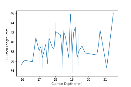
E. Similarly, we can try the following command to see another possible implication for another subset of penguins data:
set2 = penguins[penguins["Island"] == "Torgersen"]
sns.lineplot(data = set2, x = "Culmen Depth (mm)", y = "Culmen Length (mm)")
Now We may want to do something more, such as seeing implications between two variables from multiple species in one graph.
A. To gain a better sense of data, we can use set_index command for dataframe objects(here is the penguins) where we specify the keys to be the index:
penguins = penguins.set_index(keys = ["Species","Island","Body Mass (g)","Culmen Length (mm)"])
| Body Mass (g) | ||
|---|---|---|
| Species | Culmen Length (mm) | |
| Adelie Penguin (Pygoscelis adeliae) | 32.1 | 30.50 |
| 33.1 | 29.00 | |
| 33.5 | 36.00 | |
| 34.0 | 34.00 | |
| 34.4 | 33.25 |
B. Since we may not need certain columns that do not contribute to our data visualization, we use .drop() command for data frames to drop specified columns:
smallset = penguins.drop(["studyName", "Individual ID","Comments","Sample Number","Region"],axis = 1)
C. We can now use .stack() to put information together in one column and python will group them by index. We followingly use .reset_index() to turn the index columns into regular columns for plotting purposes. The commands are:
smallset = smallset.stack()
smallset = smallset.reset_index()
D. We are more ready to make plots. First, we can divide the body mass by 100 to get smaller units of numbers for easier views. By using groupby, we group the data according to the specified columns.
averages = smallset.groupby(["Species","Culmen Length (mm)"])[["Body Mass (g)"]].mean()/100
averages = averages.reset_index()
averages.head()
| Species | Culmen Length (mm) | Body Mass (g) | |
|---|---|---|---|
| 0 | Adelie Penguin (Pygoscelis adeliae) | 32.1 | 30.50 |
| 1 | Adelie Penguin (Pygoscelis adeliae) | 33.1 | 29.00 |
| 2 | Adelie Penguin (Pygoscelis adeliae) | 33.5 | 36.00 |
| 3 | Adelie Penguin (Pygoscelis adeliae) | 34.0 | 34.00 |
| 4 | Adelie Penguin (Pygoscelis adeliae) | 34.4 | 33.25 |
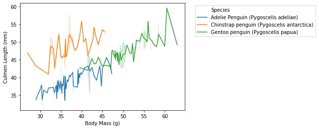
E. Now we are ready to plot with data that we have. We still use the lineplot command in seaborn. We specify the data set, x variable, y variable, hue.
- for instance, if we want to the the implication between body mass and culmen length, we can run similar command as above. Then we can adjust the legends by specifying certain numbers, but this is not that kind of important in starting data visualization.
- we will run the following command:
sns.lineplot(data = averages, x = "Body Mass (g)", y = "Culmen Length (mm)", hue = "Species") plt.legend(bbox_to_anchor=(1.05, 1),loc=2) plt.savefig("pd-1-example-plot.png", bbox_inches = "tight") - the result will look like this:
- we can also specify a particular species that we want to look like:
- we first use averages[“Species”].str[0] == “A” which will give us a boolean result that is True or False. This command gives the result of whether the name of Specieas begin with letter A.
- we then use averages[averages[“Species”].str[0] == “A”] which will return us the filtered data where averages[“Species”].str[0] == “A” gives True.
begins = averages[averages["Species"].str[0] == "A"]
- then the following things will be similar to plot
- the commands will be:
sns.lineplot(data = begins,
       x = "Body Mass (g)",
       y = "Culmen Length (mm)",
       hue = "Species")
plt.legend(bbox_to_anchor=(1.05, 1),loc=2)
plt.savefig("pd-1-example-plot.png", bbox_inches = "tight")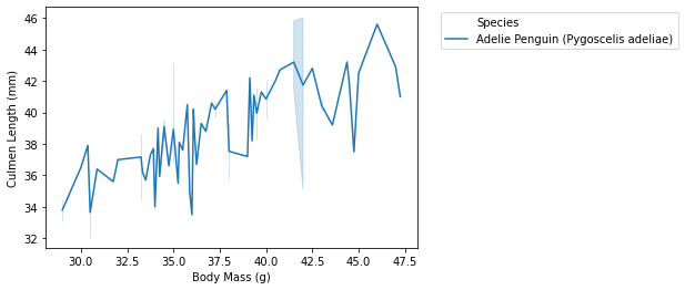
- we will run the following command: